
|
| A study asked participants to indicate preferences on four separate graphical criteria for packaging. Source: Westerman et al, Food Quality and Preference 27. |
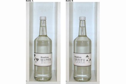
It’s clear packaging design is an essential component in the success of any brand, both at the point of sale and in forming purchasing preferences for the future. What might be less apparent is how to harness that design to work for you. A new study sought to determine the effect of label design on consumer preference by asking participants to choose a favorite between different labels on two separate products (water and vodka).
One hundred-sixteen alcohol-consuming participants (49 female, 67 male) with an average age of 22.12 years old were recruited from the University of Leeds for the study. Participants rated eight alternative packaging designs on nine items to create the dependent variables.
Participants were asked to rate each design using a five-point Likert scale with anchors of “Definitely not” and “Definitely” for nine items: “I would purchase this product,” “this design is attention grabbing,” “this design is typical for this product,” “this design is visually appealing,” “this design would be practical,” “I think this product would be nice tasting,” “I think this product would taste refreshing,” “I find this design pleasing,” and “I find this design annoying.”
The study proceeded under the premise that aesthetic preference could be linked to simplistic packaging design features. It found a preference for rounded and upward-oriented shapes, right-aligned graphics and left-aligned text. The data suggested congruence between graphical and product form may be advantageous due to the congruent effects of taste sensations. For example, angular shapes tend to be associated with sparkling water’s “sharp” taste while rounded objects are associated with still water’s “round” taste.
The preference for rounded shapes is consistent with the theory that viewing angular shapes results in increased activation of the amygdale, causing a fear response. However, exceptions exist,such as a 2011 study that found participants preferred angular yogurt pots, suggesting the importance of market, temporal and consumer context.
Preference for an upward graphical orientation was unsurprising given the impact of the fear response discussed above. In previous studies, downward Vs and downward-pointing triangles tended to capture attention more quickly than upward Vs or triangles, suggesting they are particularly representative of displays of threat. However, no evidence for such a relationship was present in this study.
Respondents’ preference for right-oriented alignment of graphics can also be explained by the brain’s processing mechanisms. Because the left hemisphere is biased toward verbal processing, and the right is biased towards visuo-spatial processing, recall of presented material is greater when text is presented on the left and graphics on the right of the packaging.

