Food Packaging
Food Packaging: The new honey pot
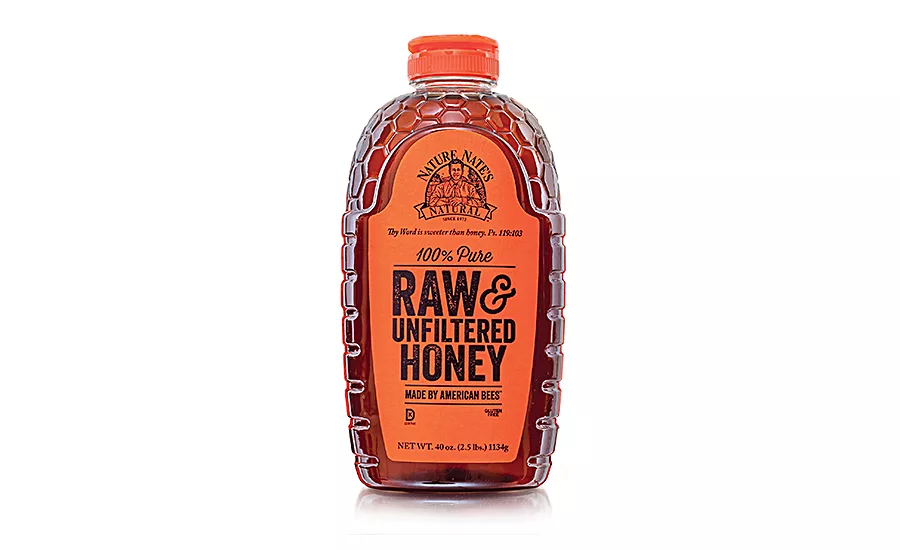
Nature Nate’s new bottle holds the company’s raw and unfiltered honey. Source: Berlin Packaging.
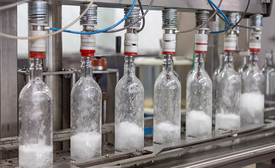
When Nature Nate's set out to redesign its honey bottle, the company wanted a unique container that was more user-friendly and assisted, didn’t hinder, supply chain management. The company worked with Berlin Packaging’s Studio One Eleven to avoid any hiccups along the way to creating the new packaging for its raw and unfiltered honey.
“The primary concern when redesigning packaging is ensuring an uninterrupted supply of containers for production,” notes Jason Melott, packaging consultant for Berlin Packaging. “We can test for the potential issues we know about, but it’s the unpredictable ones that can really cause problems.”
For instance, containers made from newly designed and manufactured molds can lead to unexpected outcomes. To manage unforeseen challenges, Melott suggests having a supply of alternative packaging on hand. “We work very hard to ensure backup plans are in place so we aren’t caught in a situation where production is impacted,” he says.
Nature Nate’s new bottle has a “reverse hive” shape, with a bottom that resembles a beehive and a top exposing the honeycomb. The label has a die-line with the bottle shape matching the circular logo. Also, the bottle is embossed, simulating a glass effect that reflects light off the honey.
The bottle is BPA free, which Nature Nate says is important to its customers. Additionally, the bottle is more comfortable in a customer’s hand due to the ridges on its side for gripping. Plus, the dripless cap has a new closure with a “suck-back” feature that prevents product from sticking to it.
What the rebranding effort did not change was the color. Nature Nate wanted to keep its recognizable orange on the bottle and, in fact, play it up. Thus, the new cap’s color matches the label.
For more information:
Jason Melott, Berlin Packaging, 214-710-3537,
jason.melott@berlinpackaging.com, www.berlinpackaging.com.
Looking for a reprint of this article?
From high-res PDFs to custom plaques, order your copy today!