Design/Branding/Marketing
J.M. Smucker Launches New Look for Smucker’s Fruit Spreads
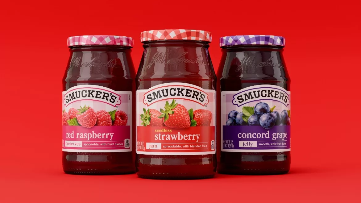
The J.M. Smucker Company has launched a new look for Smucker’s fruit spreads for the first time in nearly 30 years.
The redesign builds on the brand's '90s-era packaging, aligning its heritage with modern snacking moments. Consumers will still enjoy the same quality, ingredients and flavor they expect from Smucker's jams.
The refreshed design keeps the brand's signature gingham front and center, with it now appearing on both the lid and the front label. Distinct, vibrant colors for each flavor are paired with bigger fruit imagery.
"This redesign was about honoring the Smucker's brand's most iconic assets and evolving them with modern intention," says Dayna Lewallen, senior design manager, creative and design, The J.M. Smucker Co.
New jars will begin rolling out on shelves this spring.
Looking for a reprint of this article?
From high-res PDFs to custom plaques, order your copy today!